Before reading this tutorial, you should already be familiar with the concepts of an arithmetic mean, a z-score, and a regression line. If you are unfamiliar with arithmetic means, see the tutorial on Mean, Median, and Mode. If you are unfamiliar with z-scores, see the tutorial on Dispersion. If you are unfamiliar with regression lines, see the tutorial on Regression.
Two variables are said to be "correlated" or "associated" if knowing scores for one of them helps to predict scores for the other. Capacity to predict is measured by a correlation coefficient that can indicate some amount of relationship, no relationship, or some amount of inverse relationship between the variables.
In this tutorial you will examine the following concepts:

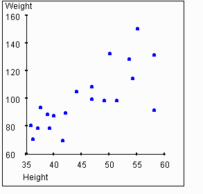
Looking at this graph, you should get the sense that there is some relationship between a person's height and their weight. In particular, if you know that a person's height is greater than average, you might expect that their weight is also greater than average. The strength of this association between two variables is called the correlation. We will use the symbol r to represent the measure of correlation.
What should a measure of correlation r depend on? Obviously
it should reflect how strongly the two variables are related. If knowing
the value for the variable on the x-axis of a graph implies perfect knowledge
of the value for the variable on the y-axis, then this point should fall
on the
regression
line.
If knowing the value for the variable on the x-axis gives
a strong ability to predict the value for the variable on the y-axis, then
this point should fall near the regression line, depending on the accuracy
of the prediction.
If knowing the x-value for the variable gives only a weak ability to
predict its value on the y-axis, then the y-value for the point will
tend to fall further from the regression line.
Thus, it is reasonable to expect that the strength of
a relationship would be visible on a
scatterplot
of the two variables, such as shown in the graph above. When the points
on the scatterplot are clustered close to the regression line, r
should be high. For example, if knowledge of an individuals' height (x-axis)
is helpful in predicting weight (y-axis), then the points on the scatter
plot should cluster around the regression line, and r should
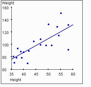
be positive. The next graph shows the plot of weights vs. heights with
the regression line added.
Pearson's correlation coefficient r is the most commonly used measure of association in the social sciences. r summarizes the linear relationship between two variables having ranked categories. That is, the variables may be continuous, ordinal, interval, or ratio. Its formula is as follows:

In this equation, n is the sample size,  is the observed sample mean for variable x,
 is the observed sample mean for variable y, Sx is the standard deviation
for variable x and Sy is the standard
deviation for variable y. Xi and Yi represent the values of variables x and y for the ith individual in the sample. The values for r
generated by this equation will range from -1 to 1. A value of -1 indicates
a perfect inverse correlation between the variables (that is, when the
value for one variable is high, the value for the other variable is low).
A value of 0 indicates no relationship between the variables. A value of
1 indicates a perfect correlation between the variables.
In the example data set above, the scatterplot and regression line lead us to believe there is a correlation between height and weight. The value of r for this data set is 0.76. As we expect, this is much higher than a value of zero, thus indicating a correlation between the variables. But the value is less than 1, indicating that the relationship between the variables is not perfect.
Regression and correlation are intertwined. In fact, the slope
of the regression line is directly related to the value of r,
as will be explained below. For now, we only need to recognize that, as
the value of r moves away from 0, the data points will cluster
closer to the regression line. This concept is illustrated in the following
activity.
Activity 1
Below is a scatterplot for a hypothetical set of points. You can grab the blue line (initially lying on the x-axis) and move it up or down to adjust the value of r through a range of -1 to 0 to 1. As you move the line, the points move as well to yield the desired level of correlation.
Try moving the blue line and observe the corresponding movement in the
data points. You will notice that the data points align closer to
the blue line (which is also the regression line for the data points) as
you approach a 45 degree angle from the x-axis. The value for r
(shown in the upper right corner of the graph) changes with movement of
the regression line.
Activity 2
Now, let's reinforce the ideas of Activity 2. Suppose that an international corporation headquartered in the U.S. sends a large group of employees to its main offices in each of three countries -- Bolivia, Denmark, and Hong Kong. Each team consists of comparable numbers of executives, supervisors, technicians, secretaries, etc. who are about to leave the U.S. to take up residence in one of the three countries. All of the workers will be paid in an amount equivalent to their American salaries. However, these salaries will be converted into local currencies.
If each frequency distribution of income scores is superimposed on a grid where each square of the grid represents 10,000 units of currency, then the overall width of the x-axis will change depending on which currency is used. However, the distribution of incomes does not change. Somebody making a relatively high salary (at least, relative to the other team members) under one unit of currency will still be making a relatively high salary if the currency is converted properly.
Below, you may choose between three histograms. Each histogram represents an income frequency distribution for one of three countries). The sample size and frequency is identical for each histogram (thus, nBolivia = nDenmark = nHong Kong).
Activity 3
Assuming that the side of an individual square on the grid stands for a constant number of units, the ratio of the sides of a scatterplot will vary with a change in the units of either of those variables. Let us consider again the example of comparing peoples' heights to their weights. If we change the measure of height from inches to centimeters, the value on the x-axis (weight) will stay constant, while the y-axis (height) will change when the unit of measure for income is changed. Of course, changing the unit of measure for the height does not affect the measure for the strength of the relationship.
We can eliminate the effects of the unit of measurement by transforming the values to Z-scores. Just as the strength of the correlation remains unchanged by changes in units, the strength of the correlation remains unchanged when we transfrom the values to their Z-scores.
To transform scores on X and Y to Zx and Zy, use the following equations:


where X is a score on an independent variable, ![]() is the sample mean of scores on X, and
sx
is the standard deviation of the scores on
X, and similarly
for Zy, the standardized scores for Y,
the dependent variable.
is the sample mean of scores on X, and
sx
is the standard deviation of the scores on
X, and similarly
for Zy, the standardized scores for Y,
the dependent variable.
Recall that the raw regression coefficient byx indicates the average change in the predicted value for scores on Y that occurs when there is a one-unit increase in the value for X. Byx is the standardized regression coefficient. It indicates the amount of change in the predicted value for Zy that occurs when there is a one-unit increase in the value of Zx. As you saw above, the changing size of the empirical units of X and Y may affect the appearance of a frequency distribution, but not the relative distance of scores from each other on either variable. Similarly, a change in empirical units of X and Y may affect the appearance of the relationship when presented in a scatterplot. This change also affects the size of byx, the raw regression coefficient. But, changing the units of measure does not affect the size of Byx, the standardized regression coefficient. By converting all scores on X and Y to standardized scores, you standardize the measure for the correlation coefficient.
Changing from raw scores to Z-scores affects the range of values possible
for the regression coefficient. Since raw scores can exagerate the height
of the value on the y-axis, the slope of the regression line can be arbitrarily
high. Thus, the raw regression coefficient can be anywhere in the range
- to +
to + .
When the scores are standardized, the regression coefficient must fall
between -1.00 and +1.00, inclusive.
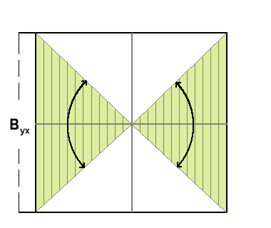
The next graphic represents the standardized regression slope (Byx). The colored (green) area shows the possible range for the standardized regression slope when Y depends on X.
The correlation coefficient can be defined in terms of the regression coefficient as follows:

Thus, knowing the values of the raw regression coefficient (byx), sx (standard deviation of variable x) and sy(standard deviation of variable y) allows us to compute ryx, the correlation coefficient.
When we convert to Z-scores, the standard deviation of variables x and y becomes 1. Thus, we see from the above equation that the value of the standardized regression coefficient is the same as the value of the correlation coefficient.
If height is related to weight, then obviously weight must be related to height. In other words, if knowing the height helps us to predict the weight, then knowing the weight should be equally helpful in predicting the height.
The first graph in this tutorial showed height on the X axis (the independent variable) and weight on the Y axis (the dependent variable). This is an arbitrary selection, and we can flip the axes as follows:
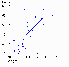
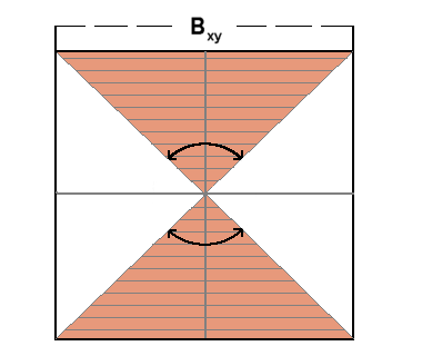
If we flip the axes, then we also change the slope of the regression line. The next graphic shows the standardized regression slope (Bxy) -- that is, the indication of how Zx relates to Zy, rather than the more typical indication of how Zy relates to Zx. The colored (red) area represents the possible range within which Bxy must fall.
If two variables are correlated, then they are related in the sense that knowing the value for one variable can help to predict the value for the other. It also means that high values of one variable tends to occur along with high (or low) values of the other variable.
Correlation is quite different from a cause-and-effect relationship. Often we would like to know what causes something to happen. For example, what causes a person's height to be a given value? We have already seen that height and weight are correlated. Does this mean that a person's height is "caused" by their weight? This seems to be a silly proposition, and it is. One way that we can clearly see that this proposition is silly is to recognize that a person can increase or reduce their weight by dieting, and this will have no affect on their height.
If we know that a person's height and weight are correlated, and we know that the weight does not cause the height, does this necessarily mean that the height "causes" the weight? In other words, must there always be a cause-and-effect relationship between two correlated variables?
The answer is no. One possibility is that the correlation we see is merely coincidental. That is, we may simply have gathered a peculiar sample that has two correlated variables, but the general population does not have this same correlation.
Even when two variables are statistically correlated, it is not necessarily
the case that one variable causes the other. It is possible that both variables
are caused by a third variable. In the case of our example of height and
weight, the individuals sampled are children in the age range 3 to 13.
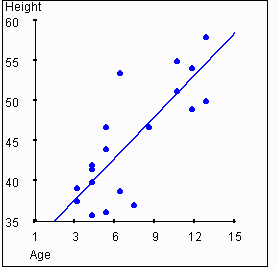
Consider
the following two graphs. One shows the relationship between age and height,
while the other shows the relationship between age and weight.
 |
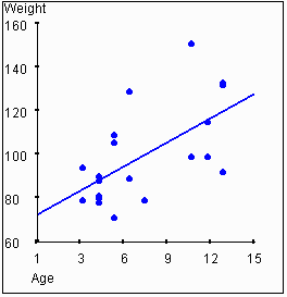 |
In this example, height and weight are correlated to each other, and
they are also each correlated to age. It is reasonable to hypothesize that
a person's age "causes" their height and weight to some degree. Clearly,
neither height nor weight "causes" age.
Activity 4
Imagine that you are trying to predict the score that a random individual
will have for some variable Y.
What value should you guess
if you know nothing about the individual? The best guess that you could
make is the mean for the variable,
 .
How much is your guess going to be wrong "on average"? The "average" distance
from the mean will be the standard deviation, sy.
Now, consider what happens when you try to predict the score for some individual on variable Y, but you already happen to know the value for that individual on variable X. If Y and X are correlated, then you can make a better prediction. If the variables are perfectly correlated (that is, the value for r is 1 or -1), then your prediction for Y will be completely correct if you know X. The data points, when shown on a scatterplot, all fall on the regression line. In this case, given a value for X, the value that you predict for Y should be taken directly from the regression line.
If the variables are not correlated at all (that is, the value for r is 0), then the best prediction you can make for Y will just be the mean for Y, and the average error in your prediction will be sy.
When the correlation between X and Y has
an r value somewhere between 0 and 1, then the average error
in the prediction will be somewhere between 0 and sy.
The value of the correlation explains some of the variance in Y.
The amount of predictability is called the
coefficient of determination.
In visual terms, as the value of r increases, the data points
appear closer and closer to the regression line. The "standard deviation"
from the regression line drops as the correlation increases. Thus, the
ability to predict improves as the correlation increases. We can see that
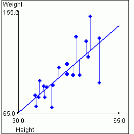
this is so from the following graphs. The graph on the left again shows
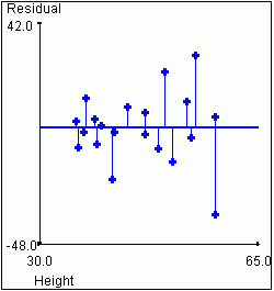
height vs. weight. The graph on the right shows the "residual" weights after
we have removed the variance that is "explained" by the value of the height
for a given data point. This is equivalent to rotating the graph so that
the regression line lies on the X axis.
|
|
| Total Sample Variance for Weight = 491.62 | Variance in Weight not Accounted for by Height = 210.10 |
Activity 5
Below is a scatterplot for a hypothetical set of points. You can grab the blue line initially lying on the X axis and move it up or down to adjust the value of r through a range of -1 to 0 to 1. If you prefer, you can grab the other blue line (initially lying on the Y axis) and move it side to side. Notice that when one line is moved, the other line moves with it. The line that is initially horizontal is the standardized regression line defining the variance in the Y axis explained by the variable on the X axis (byx). The line that is initially vertical is the standardized regression line defining the variance in the X axis explained by the variable on the Y axis (bxy). They are equivalent when reflected around the line at a 45 degree angle from the X axis, and they both determine the strength of correlation. Try moving either blue line and observe the corresponding movement in the data points as well as the movement of the other line.

The numerator in this formula is known as the covariation. It is the sum of the product of the deviations of the X and Y values for each case from the means of X and Y. Dividing the covariation by N-1 results in the sample covariation. Notice that covariance is maximized when large departures from the mean of X are paired with large departures from the mean of Y. If these large departures are generally paired in the same direction, the covariance (and also r) will be positive. If large departures on one variable are commonly paired with large departures on the other variable in the opposite direction, then covariance (and r) will be negative. To the extent that high variance in one variable is associated with variance in another, the one variable is said to "explain" variance in the other. This is so whether r is positive or negative.
Note that "explaining" variance is not the same as "causing" variance! When we say that one variable "explains" variance in another, it means only that knowing the value of one variable helps us predict the value of the other. This does not mean that we claim the first variable causes the value of the second.
The following activity shows two circles. The circle on the left represents the total variance in variable Y. We assume Y is our dependent variable, that is, the variable we are trying to "explain." Therefore, in a sense, Y represents the totality of explained variance. The circle on the right represents the variance accounted for in Y, by the independent variable X.
So long as the two circles do not overlap, the value of covariance (r2) remains zero. Once the two circles overlap, a new pattern emerges. The amount of overlap is represented by a positive value for (r2).
Since the circle on the left (sx2)
represents the total variance in Y, our dependent variable,
and the circle on the right (sy2) represents
the variance in Y accounted for by X, then
the area represented with dashed lines (the area of merging between the
two circles) represents the covariance between the two variables.
Activity 6
Place the cursor over either circle, then push the left mouse button
and slide the cursor toward the other circle. Notice that as the circles
merge toward a complete overlap, the covariance increases.
Return to Table of Contents